Don’t you feel that the more website templates you look at, the more they look the same unless you’re specifically looking for something specific?
You’re not a great designer. You’ve got a long way to go before that is even a remote possibility.
It can be overwhelming to pick the right design for your website.
Choosing a template for a website can be a lot of fun, overwhelming, or most people – somewhere in between.
While most platforms offer a few basic designs – and some even offer 3rd party premium templates – it’s easy to drown in a sea of seemingly endless options, particularly if you want to create something truly unique.
Here is some basic information on how you can make this process easier.
We’ve developed a set of criteria we use when suggesting templates that will help you sift through the design options.
When you’re choosing a website design, there are three qualities you should look for:
- Content Width Design
- Home Page Header Design
- Menu Bar Design
What Content Width Will Look Best On My Page?
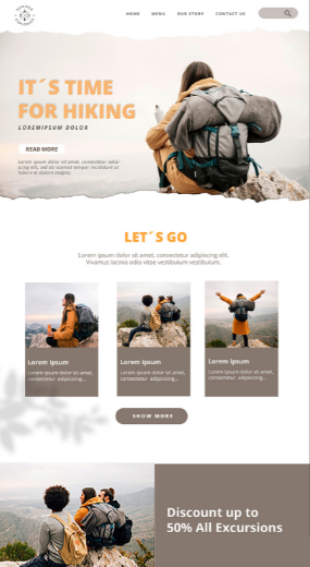
- Full-width designs are better for creative, contemporary designs.
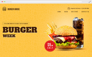
- Boxed-width designs are more appropriate for traditional, business-oriented designs.
Full-width allows your Content to stretch from edge to edge, so it feels like your site has been designed to have no boundaries.
Boxed width is when the visible frame to the left and right side of the screen has a set area. This makes it feel like the Content is boxed into that area.
Here are some illustrations:
- Trendy website layout.
- This is an excellent option for mobile responsive templates and graphics-heavy websites.
- Widening your width allows you to fit more tabs in your menu bar.
- As the background image auto-adjusts to fit the screen, the position of the Content on the top of the image may change on computer screens with different sizes or resolutions. Some people may find this annoying.
Note: When using a responsive design, be mindful that the content orientation and alignment may vary depending on the website’s web browser or device.
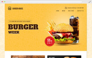
- Professional, business-oriented website design.
- Provide a fixed width so the content display and position remain relatively the same across different monitor sizes and resolutions. You won't have to worry about people having different visual experiences.
- Boxed-width design works best if you want your content display to be consistent and predictable across all monitor sizes and resolutions.
Think of how you want your website to feel.
Do you want to use a more contemporary design? If so, a full-width layout will work well.
If you want your website to feel more traditional and business-oriented, we’d recommend a boxed-width design.
Business websites can still work well with full-width designs. But if you don’t know where to start, our suggestion above is an excellent way to get started.
Which Home Page Header Layout Will Work For Me?
- Choosing the right header for your home page requires understanding what your business is and who your competition is.
- The majority of websites’ home pages have a header. It’s the section towards the top of your home page. Usually, the first thing your visitors see when they visit your website.
- Most website templates have a homepage header of some sort. These headers can contain static images, slideshows, or even videos.
- However, do not be distracted by pretty pictures or flashy designs. Do not pick the type of header design that you are the most impressed with.
- It’s important to consider whether a homepage header you select will help or harm your business.
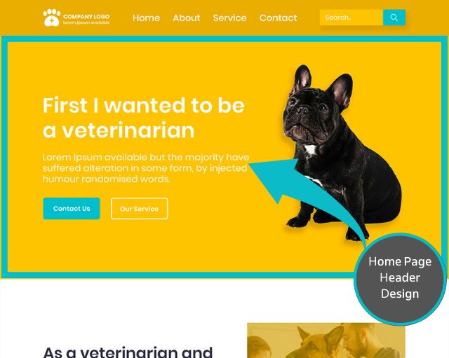
Choosing a header design is a strategic decision, more so than a design decision.
A homepage header that is carefully designed will successfully communicate your core message to your visitors. The first thing your visitors will see in the portfolio, and you have a short period to make a good first impression.
Your header needs to create awareness and understanding of what you’re about rather than look nice.
Now that you understand a header’s role and how it helps your visitors better understand what you’re saying, how do you choose?
Different types of websites work best with varying sorts of headers.
We’ll show you the common types of headers, what kind of business would benefit from each, and how to tweak them to fit your business.
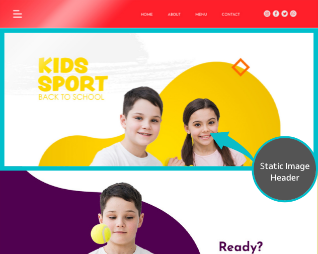
1. STATIC HEADER IMAGE WITH NO CONTENT
Who should use this?
A static image header should be used in websites where the beautiful photograph is heavily relied on to attract customers — such as hotels, restaurants, and some physical products.
For example, if you own a Apparel business, your website should welcome your guests with a captivating image of your Apparels. Your company’s appearance on your website will directly impact your visitors’ decision to buy the product online
In the case of most websites, it makes sense to use a template with a large or full-page static header image because you want to create an amazing visual first impression for your visitors.
The visual Message could translate into the type of experience they would have if they stayed at your website.
Who should not use this?
- If you want to explain what you do and how you can help your customers, relying purely on a static header image is not ideal.
- A static header image can take up valuable space “Above the Fold”- that is, the area your visitors see when they first land on your website.
- So if your business requires text to explain who you are and what you’re all about, relying solely on a static header image (without Content) might leave your visitors slightly confused.
- Relying solely on an image to communicate what your website is about might work well for businesses such as restaurants or hotels, but it doesn’t work for many other businesses. For these sorts of companies, you’ll need to rely on more than just an image.
Ask yourself this question – Is your business website can easily be explained through a simple image with minimal text?
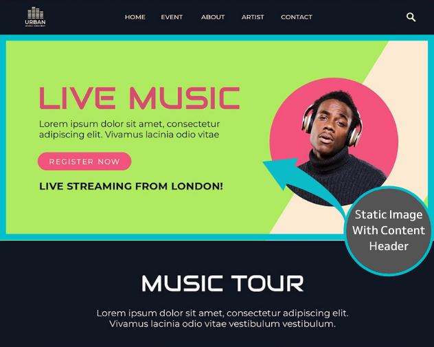
2. STATIC HEADER IMAGE WITH CONTENT
Who should use this?
All websites can use this type of homepage header. This design is the safest choice if you don’t know what to choose.
A static image header with Content gives you 3 essential elements. Above-The-Fold, they can effectively describe what your business is about:
- Headline & Supporting paragraph : The header image should support your headline
- Call to action (what you want your visitors to do next) : Your primary call to action
- Supporting image: An image that reinforces your business mission as Banners
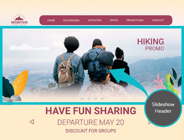
3. SLIDESHOW HEADER WITH CONTENT
Who should use this?
For businesses that cater to a variety of customer types or have multiple core services or products, a slideshow header works best.
If your company has different solutions for various demographic groups, a slideshow header allows your company’s products/services offerings to be showcased in an organized way.
Ex – 1 Wix targets people with different purposes for the website.
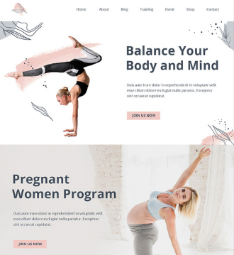
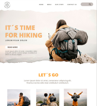
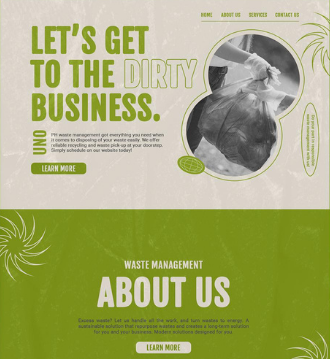
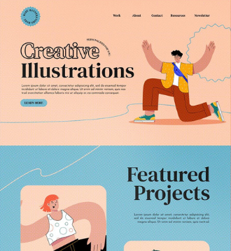
Ex- 2 ThemeKingdom offers themes for different types of businesses.
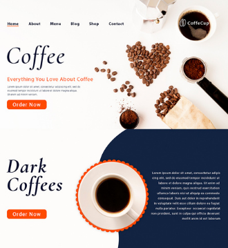
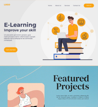
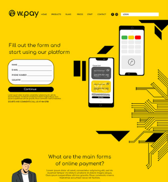
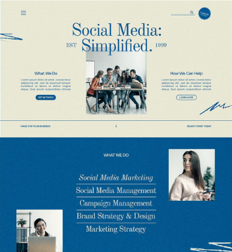
If your business targets different groups of customers or offers other products and services, a slideshow-based header could work well to target various classes of customers or show the variety of offerings.
4. VIDEO BACKGROUND HEADER
Who should use this?
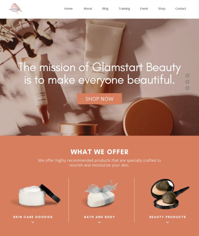
A video background header is an excellent way to explain your business mission by featuring the scope of your business process in an engaging way.
Using moving images or videos to grab people’s attention, it is not surprising a lot of successful websites use video backgrounds to improve engagement and brand awareness.
When used correctly, most small businesses can benefit from video background headers.
If you decide to use a video background header design on your website, here are some tips to keep in mind:
DO’S & DON’TS
- Use videos that carry a message –Pick videos that support your mission, Message, or mood. This works especially well if you are a lifestyle brand.
- Use a unique video to give your website more personality and create a connection with your customers.
- Use high-quality videos with a high quality of production – to showcase the quality of service or products as it reflects on your business.
- Use small videos, (file size under 5MB), to keep your website loading fast and to avoid performance issues.
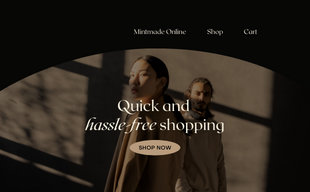
Check out these examples of websites that use video headers effectively:

3. Which Menu Bar Design Should I Choose?
The menu bar has a powerful impact on your customers’ perception. It’s the first thing they see and the last thing they read.
Many people tend to focus on the wrong things when choosing an off-the-shelf website template. The utility of the design is more important than its esthetics.
An often-undervalued element of the website design is the menu bar design. It includes types, positions, and the layout of menus.
It’s essential to choose a system that fits your business’ needs.
Why is menu bar design important to your theme?
The menu is the primary tool that your website’s audience uses to navigate the website. It creates a road map to guide your visitors around the website and where they should focus their attention.
If a visitor couldn’t figure out how to find the information they were looking for on your website, then your website failed miserably… no matter how good it looks!
1. THE DO’S & DON’TS OF Using MENU BAR DESIGN
Do’s
-
Choose a clean, simple design for menu tabs that makes them easy to read and access.
-
Choose a background color that is easier on the eye (nothing too flashy). Highlight the menu tab text with a contrasting color to make them stand out.
-
Create a hierarchy for your pages. Designate your most important pages to the left side of the layout.
Don’t’s
-
Keep your menu limited to what’s essential. Don’t clutter your site with too many page tabs; only display essential ones for your business. It’s easy to add more as your passion for your business grows, but this may overwhelm your visitor.
-
Don’t use fancy backgrounds that make menu bars hard to read. Eg: adding backgrounds images and patterns to menu bars.
-
Don’t make your font size too small or use fancy fonts that make it hard for your customers to read your site.
2. CHOOSE YOUR MENU BAR POSITION
If you’re wondering how your website visitors will experience your website, you should pick the type of menu bar design that will guide you.
Fixed Position Menu Bar (the menu stays at the top of the page all the time)-
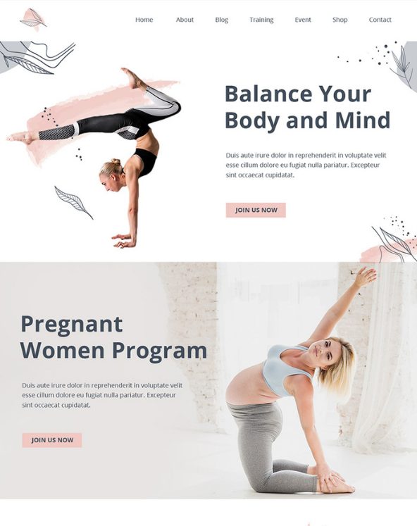
This is good for websites with a lot of Content (long pages). Fixing the menu bar to the top or side of a page lets your visitors quickly switch between pages without going back to the top. If your website doesn’t have long pages (not content-heavy), it becomes less effective (and slightly pointless) to have a fixed menu bar at the top of the page. If you don’t use a fixed-position menu bar design, you’ll have more template design options at your disposal. Consider whether your website truly needs this feature.
Top Horizontal Menu Bar –
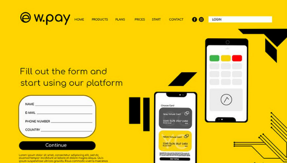
80% of traditional (classic) websites use the style of menu bar design shown below. Traditional website menu bar design is popular because it is effective.
People are conditioned to look for the menu bar at the top of a web page. The width of the browser limits the width of the menu bar.
As the ultimate menu bar design, the classic style sets an elegant tone for your business. It’s sophisticated, timeless, and popular worldwide.
Side Vertical Menu Bar –
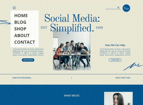
On graphics-intensive websites, having a menu bar on the side is quite popular (such as a portfolio, restaurant, salon, spa, etc.).
Vertical menu bars are effective for websites with multiple menu tabs or long title menu bars.
Be aware that some website templates have “fixed” side vertical menu bars, so there are limits to how many tabs you can add. Some templates feature a scrollable vertical menu bar, so the number of tabs you can display is limitless.
5. LOGO POSITIONING
Logo positioning is not random. What your logo is positioned says a lot about your business’s goals.

Place the logo on the same level/line as your menu bar – This web design works best for websites that focus more on promoting their products or services and less on business branding. As the logo is within the menu bar, its size is limited.
This design is also used by B2B (Business-to-Business) businesses, where branding and marketing are less of a focus than retail businesses.
Of course, the brand logo is still essential, but just less pronounced as the brand logo is limited by the menu bar.

Put the logo in the center with the menu bar (either below or above it) – If you emphasize creating a brand identity, this is the most effective design choice as your logo is more prominent. Your customers are more likely to pay attention to your logo because there is less restriction on its size.
Logo layouts for retail businesses are quite popular because they help to create a brand identity and promote brand loyalty.
You might consider how you want your logo to be positioned. If you are more focused on branding, placing it above or below your menu bar can help you accomplish that goal.
Choose your website template design – let’s apply what we discussed
Now that we’ve discussed three criteria to help you pick the right website template let’s put them into practice to figure out what works for you and your business.
We will also give you two sources of where to start looking for templates and show you examples to see how the process can work.
Step 1: Choose the best combination for your website:
1. Content Width Design
-
- Full-width – more contemporary look
- Boxed-width – more traditional look
2. Home Page Header Layout Design –
- Static Image (No Content) – If a single image can effectively tell your brand’s story
- Static Image (With Content) –if your business needs text headlines to explain what your business does – the most common
- Slideshow –to highlight different customer types you are targeting or different products/service offerings you offer
- Video Background – If a video would be useful to tell the story of your brand.
3. Menu Bar Design –
Make sure that background and fonts are easy to read – plain background color and plain fonts with a contrasting color.
Menu Position –
- Fixed Position –This is what you can do if your website has long scrolling pages. It’s simple for visitors to find the menu bar.
- Horizontal (Top) –A limited menu bar for the website with less than eight items – most common position
- Vertical (Sidebar) – This is perfect for graphics-intensive designs with a lot of menu bar items.
4. Position of Logo –
- Same Level as Menu Bar –has less branding and allows more room for Content.
- Above or Below Menu Bar – The logo is more prominent on the left, but it gives less space for Content. It has a more significant branding effect.
Step 2: Narrow down your list to 1 or 2 choices
Once your list of design candidates has been narrowed down to two or three designs, it’s time to choose the perfect template for your newsletter.
However, it can still be challenging to make a final decision without first checking out the website templates.
If you’re using free design templates, try to insert some content in each design to see which one you prefer. Since the templates are free, this leaves you the opportunity to test out each of them.
It will be well worth your time to work with them – just like test driving a car. You never know which one you prefer until you do it – just like test driving a car.
If you are using a paid template, you can’t test out your design. We suggest you study the demo sites and descriptions of each template extensively to decide if that design may work for you.
A paid design usually costs from $50 to $150. If you find something you really like and do your due diligence on it (unless you try the design), it might be worth the risk.
Additional things that you might need to consider at the time of Themes Selection
- Colours in the theme, if it matches good, most of the time, themes provide multiple choices of colours in Demo version or after buying it. if not we can always change the colours with the help of technical team in CSS
- Please don’t get carried away finding themes with functional / features related while selecting the Themes, we will not be able to find exact theme that match 100% of our requirement without additional plugins and settings in the plugin properties.
List of websites that offer WooCommerce Website Themes (Paid and Unpaid)
- https://studio.envato.com/search?utf8=%E2%9C%93&search%5Bquery%5D=woocommerce+theme
- https://www.templatemonster.com/woocommerce-themes.php
- https://themeforest.net/category/wordpress?term=woocommerce%20theme%20wordpress#content
- https://woovina.com/demos?ref=homepage
- https://ltheme.com/woocommerce-wordpress-themes/
Conclusion & Summary
Choosing the right website template can be like buying a house – it can be confusing at times, and you’re afraid you’ll make the wrong choice.
You are unlikely to find one perfect design template that will satisfy 10 of your pages. That “unicorn” (rare and wonderful) design probably doesn’t exist unless you’re willing to spend thousands on a custom website design.
However, if you take a systematic approach to selecting designs, such as implementing the three criteria we described above, this can help you narrow down your choices from hundreds of designs to maybe just a handful. On it’s own, that’s a major victory, right?

